Additional Vertical Frontend Data View Layout
This feature is part of the Visforms Subscription and not available in the free Visforms version. It was added to the Visforms Subscription release 3.2.1.
Visforms uses a table layout for the frontend data views, where the data of each record is displayed as a row. This view is compact and suited for many purposes but it you want to display lots of information for each record set, the table may become very wide and does not fit into the page.
A data view, where the data of each record set are displayed "As List", one beneath another, has the advantage of being able to fit as many information into a small space as you like. Thanks to a complete refactoring of the Visforms search filters, it is possible to search, filter and order the record sets just like in the other frontend data views.
Set a custom field order for frontend data views in order to determine the postition of each field, for example in order to display an uploaded image file at the top of each records set, although the field is displayed far below in the form view..
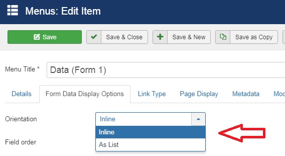
The layout is selected in the menu item
Which orientation is used for the display of the information of each record set can be selected using the menu option "Orientation" (See Screenshot). Please select the option "As List".

The Layout
It is our intention to provide you with a flexible data view. Therefore we have decided, to add no CSS to the view, that is created, if you select the option "As List". Instead we have decided on creating a very well structured HTML, which can be styled easily, because each element can be selected easily (iindividually or as element group, like all labels) through class attributes. Thus people with advanced CSS skills can style the view to their needs without having to override default css, that does not fit into their layout plans. In order to enable users with minimal CSS skills to use this view, we proved some usefull CSS examples here. If you apply the example CSS from below to your page, it will look fine.
HTML-Structure
<table class="visdatatabledatahorizontal visdata visdatatable jlist-table">
//the tr element is repeated for each record set
<tr>
<td>
//wrap main overhead fields in a div
<div class="div-data-controls">
//Overhead fields
<div class="div-data-counter">
//Label
<span class="vfdvlabel data-counter"></span>
//Value
<span class="vfdvvalue data-counter"></span>
</div>
<div class="div-data-id">
<span class="vfdvlabel data-id"></span>
<span class="vfdvvalue data-id"></span>
</div>
<div class="div-data-edit">
<span class="vfdvvalue data-edit"></span>
</div>
<div class="div-data-publish">
<span class="vfdvvalue data-publish"></span>
</div>
<div class="div-data-created">
<span class="vfdvlabel data-created"></span>
<span class="vfdvvalue data-created"></span>
</div>
//Fields. The field id is added at the end of the class attribute. I.E. field with id 13 => class="div-data-f13"
<div class="div-data-f"">
<span class="vfdvlabel data-f"></span>
<span class="vfdvvalue data-f"></span>
</div>
//Remaining overhead fields
<div class="div-data-ip">
<span class="vfdvlabel data-ip"></span>
<span class="vfdvvalue data-ip"></span>
</div>
<div class="div-data-mfd">
<span class="vfdvlabel data-mfd"></span>
<span class="vfdvvalue data-mfd"></span>
</div>
<div class="div-data-modifiedat">
<span class="vfdvlabel data-modifiedat"></span>
<span class="vfdvvalue data-modifiedat"></span>
</div>
</td>
</tr>
</table>
If an (overhead) field is not displayed, due to your form/field configuration, the respective HTML element is not created.
CSS Example
We propose, that you create a separate Visforms CSS file for this purpose. Click "Edit CSS" panel on the Visforms Dashboard. Click the "Create new file" button. Select the file type "CSS" and enter a file name, i.e. "customdataview". Click the "Create" button. Please keep the naming convention in mind. The file names must contain the string "custom". In addition you can use the characters a-z, A-Z as well as the characters - (minus) _ (under score).
Enter the following CSS example code into the newly created file and save your changes. (The comments between /* and */, which are solely for explaination best be omitted.)
/*Give div elements vertically some space */
.visdatatabledatahorizontal div {
  padding: 10px 0;
}
/*Display overhead fields at the top of the record set in a single line*/
.visdatatabledatahorizontal .div-data-controls > div {
  display: inline;
}
/*Make Labels appear like headers and give horizontally some space*/
.visdatatabledatahorizontal span.vfdvlabel {
  font-weight: bold;
  padding: 0 10px;
}
/*add colon (:) after label*/
.visdatatabledatahorizontal span.vfdvlabel:after {
  content: ":";
}
/*Add some space before and after value*/
.visdatatabledatahorizontal span.vfdvvalue {
   padding: 0 10px;
}
/*Maximale Größe für Bilder begrenzen*/
.visdatatabledatahorizontal img {
  max-width: 50%
}
Note: We always start with the CSS selector .visdatatabledatahorizontal in order to ensure, that the CSS applies only to the HTML, that is created by the data view with orientation "As List".
This is how you hide a specific label or all labels
/*Hide all labels*/
.visdatatabledatahorizontal span.vfdvlabel {
  display: none;
}
/*Hide label of a specific field (field with id 15)*/
.visdatatabledatahorizontal span.vfdvlabel.data-f15 {
  display: none;
}
After hideing a field label, you can align the value to the right.
.visdatatabledatahorizontal div.div-data-f15 {
 text-align: right;
}
