
Uikit Layouts
This feature is part of the Visforms Subscription and not available in the free Visforms version.. It was added to the Visforms Subscription 3.4.0.
Flexible, responsive forms
The Uikit is a very common framework which is used in many Joomla! templates. It comes with a "mobile first" philosopie, which allows for flexible responsive layouts. The Visforms layouts uikit2 and uikit 3 will render HTML that is fully compatible with the Uikit2 respectively the Uikit 3 framework. You neee a uikit template if you want to use this layouts.
The Visforms Uikit laoyuts will allow you to benefit from all the design options provided by the Uikit. Especially there are additional design options which are not available with the other Visforms layouts:
- Display help texts as tooltip over the control not the field label
- This allows us provide the option "hide field label" for any field type, now
- This allows us provide the option "hide captcha label"
- If you are using multi page forms, it is now possible to style additional buttons (Correct-Button, Back-Button, Summary-Button) using a custom css class, which is conform with the bootstrap button classes and thus allows very easy styling..
- Additional buttons of the frontend edit views (Save-Button, Return-Button) can be styled easily by adding custom css classes
- Any validation error message is displayed at the bottom of each field and not as a popup which allows for much clearer lines in the form
Enable Uikit Layouts
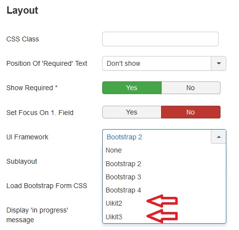
- Go to the form configuration tab "Advanced"
- Select the option "Uikit2" or "Uikit3" as "Form Layout"
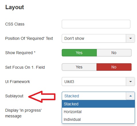
After you have made that selection, there will be a new form parameter "Sublayout", where you can select, from 3 options.
- Stacked
- Horizonal
- Individual
Select a UIkit layout
Select a Sublayout
The stacked layout
In the stacked layout, all field informations are displayed stacked. The field label is displayed in a line above the input. Validation errors are always displayed beneath the input. Custom texts can be displayed above the label, between label and input or beneath the input/potential error message. The field label can be hidden completely.
The horizontal layout
In the horizontal layout the field label and the input are always displayed in one line. The field label will occupy 3/10 of the total with and the input 7/10 of the total width in the uikit2 layout, In the uikit3 layout the field label takes 1/3 of the total width, the input 2/3 of the total width. Custom texts can be displayed above the line with field label and input or below. A validation error message is always displayed directely bellow the label/inputl line. The field label can be hidden but the space, reserved for the field label will then just be left empty. This gives the form clean lines and structure.
The individual layout
The individual layout is extremly flexible and it is possible to create forms which are highly responsive. In this layout you cannot only hide the field label, but although free it's space, so that the input moves further to the left.
You can customize:
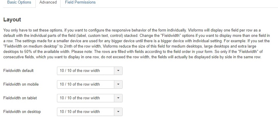
- the full width of the field (consisting of label, input, custom text, validation error) relative to the viewport width. This allows you to decide how many fields are displayed in one row (= multi column layout).
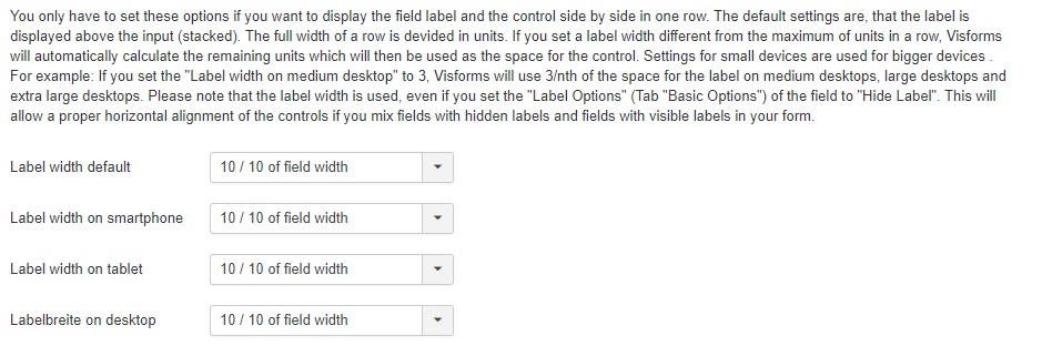
- which space of the field width is occupied by the field label.
You can set differents widths depending on the device width, i.e. on large desctops ther are 3 fields in a row on tablets 2 and on a smart phone only one, due to the way the Uikits implement responsive design.
Further on you can set an individual label width for each field and device width category. This will control whether or not label and input are displayed in one row and it will control the input width. If you assign the label 100% percent of the field width, the input will be displayed in a new row, having also a width of 100%. If you assign less then 100% of the field width to the label width, then label and input are dispalyed in on row and the field width is determined by the space that is not occupied by the label.
Custom texts and validation error messages are always displayed left-aligned with the input, which let your form look neat and tidy.
You will find a good documentation of these configuration setting in the field configuraton.
Individual width configuration in uikit2
Add css classes for buttons
The Uikits come with a set of css classes which can be use to easily format button i.e. uk-button, uk-button-primary. As a default, Visforms uses such button classes, in order to give buttons selfexplaining colors. If you do no like these colors or if the classes are not implemented in your template you can set a custom css class for the Visforms buttons in the form configuration respectively the field configuration of fields of type "Submit" or "Reset".